


A couple of months ago, we began working with Della Hudson, a Bristol-based businesswoman who had just sold her successful accountancy firm – Hudson Accountants – and was looking to create a personal brand for her new business.
The process began with a series of exploratory meetings with Della in which we discussed what her new proposition would be, who her competitors were, how she wanted to be perceived and the strategic direction of the business. These meetings gave us an acute understanding of the task at hand and we began exploring the creative options open to us.
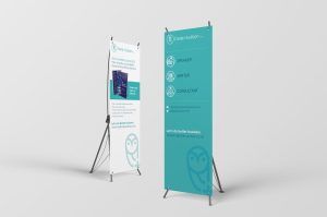
A businesswoman with a strong background in finance, Della was keen to explore the blue tones that her industry is associated with. However, she was exploring new opportunities – as a speaker, business consultant and author – and we felt that a softer, more approachable (and yet still professional) colour would be more appropriate. We chose a light teal.
At the same time, we wanted to create a strapline that would sum up all of Della’s talents, while reflecting her approach to working collaboratively with business owners. It needed to be simple, self-explanatory and shot-through with optimism and a sense of continuous improvement. After many hours in a darkened room, we settled on:
Let’s do better business.
Happily, this line also obliquely referenced Xero, an accounting software package that Della is closely associated with and would be familiar with her prospective clients.
Meanwhile, we developed the owl device, which was chosen to reflect the wise words that Della would be sharing with business owners. We were keen not to use ‘wise’ or ‘wisdom’ in the main brand messages as we felt they would be too assertive for Della’s proposition – the device itself was enough to create the implication. And, as a nod to her financial strengths, we gave the owl a ‘plus symbol’ to perch upon.
We also created three icons to reinforce the three main areas of her business, and these will be applied to everything from pop-up banners to the business website. The line drawings act as visual shorthand and are clear and simple to understand. A detail to note is the diagonal ‘notch’ in the icons, which is a reference to the angle in the typeface (most visibly at the top of the ‘ls’) and at the top of the owl’s perch.
Della says of her new branding: “There were so many things to consider with branding a new business but Sim and the team asked me all sorts of questions to understand my values, what I do (helping businesses) and how (speaking, writing, coaching, consulting, etc.) and not just my favourite colours (blue, but I’d already used it for my old business so I wanted something different).
“I find it hard to see these things visually so Sim came back and presented two brilliant ideas which we were able to combine and tweak into one wonderful whole. You know you’ve got the right branding when you can look at it and say: ‘this is me’.”
Postscript: We’re delighted to say that Della’s brand was shortlisted for Best Personal Brand in the 2019 British Accounting Marketing Awards.
Della’s new book, The Numbers Business, is available to buy here: https://www.amazon.co.uk/Numbers-Business-successful-accountancy-practice/dp/1912300168/ref=sr_1_1?ie=UTF8&qid=1536916668&sr=8-1&keywords=the+numbers+business+della+hudson