Earlier this year, we crash tested over 50 different landing pages to find out what really works when it comes to design, copy and CTA positioning. Here’s what we discovered.
First things first: different people call them different things, but we define a landing page as a standalone (possibly ‘hidden’) web page that is designed to capture leads from a campaign. It’ll have tailored content and a very specific purpose or call to action.
When crafted perfectly – ahem, read on for more about achieving that – it will increase your conversion rates and lower your costs of acquiring a lead or sale. It’s also worth noting that companies with more landing pages (30+) get seven times more leads than those with one to five. Our advice? Start small with one landing page per campaign and then build out from there to target different audiences, niches and nuances.
For now, let’s begin with the structure and content of that first ‘hero’ landing page. And take note of the order, as this is how your landing page should flow from top to bottom.

Make it personal
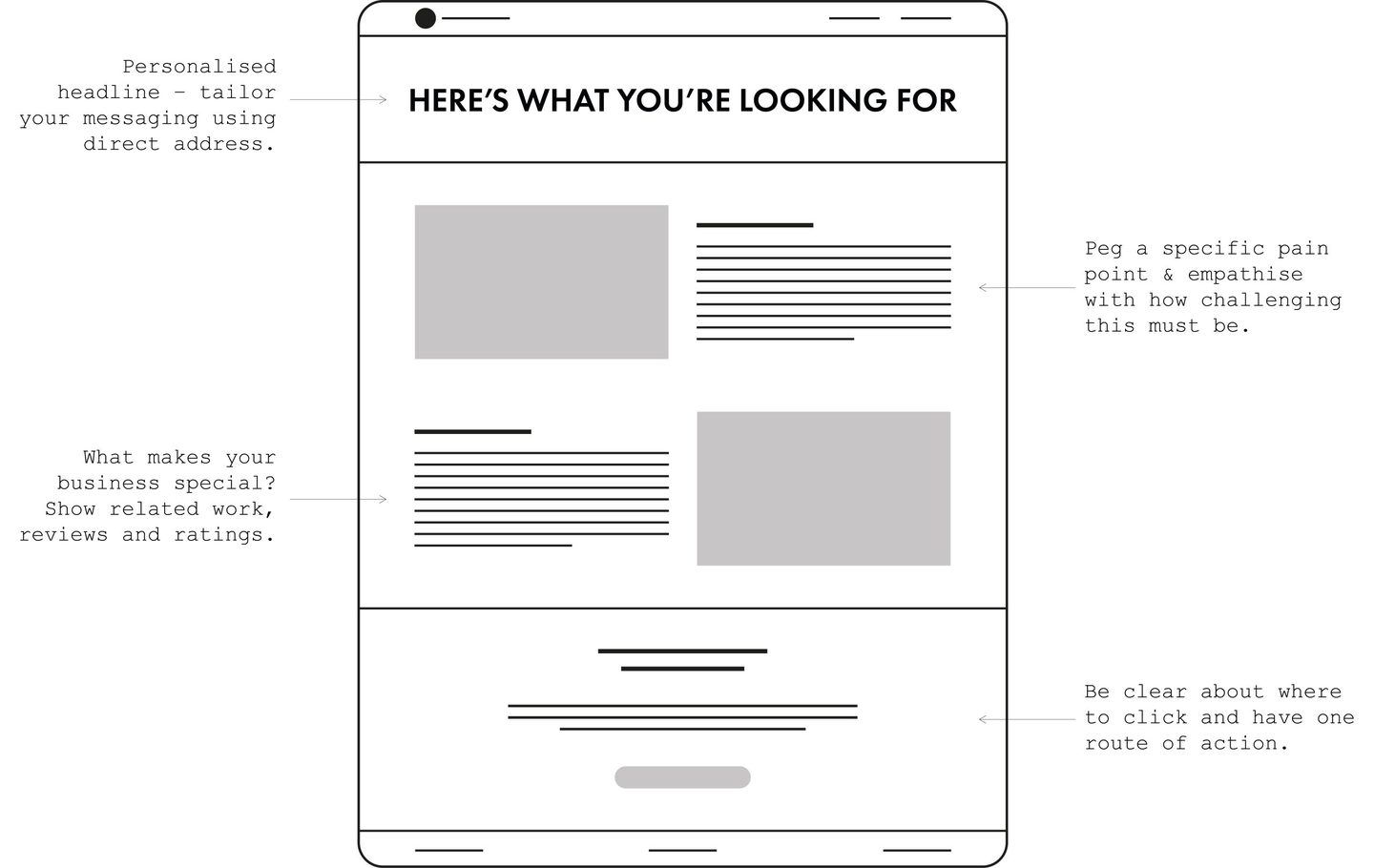
Your headline can make or break your landing page (no pressure!). We found that the best opener is a personal one, such as: ‘It’s good to meet you’ or ‘Here’s what you’re looking for’. And while this approach won’t be appropriate for all businesses, using the words ‘you’ or ‘your’ will personalise your messaging and set the tone for a more engaging experience.
Peg a pain point
Your opening copy – the first paragraph – should determine a specific pain point and empathise with how challenging this must be. The psychology behind this is that if you can demonstrate that you understand the audience’s challenge, you’ll be well equipped to provide them with a solution.
Use phrases like: ‘We appreciate that…’ or: ‘We know just how difficult it is…’ or: ‘Sometimes you just need a bit of…’.
Why you?
What’s your proposition? Or in other words, what makes your business special? This has to be at the heart of the next section of your landing page copy. And if you want to make it particularly convincing and credible, explain why your approach is better than the competition. Oh, and don’t even think about making any false claims.
This section should be about proving to the audience that you have a track record in alleviating the pain point you identified earlier. Show them related work, provide stats, benefits and examples of your approach in action. The best possible proof? Reviews and ratings. Google and Feefo reviews or Trustpilot scores are powerful and convincing.
However, keep this section short and snappy. Offer all of the necessary information but don’t include so much that you cause your visitor to get analysis paralysis, otherwise you risk driving them away.
Have a design edge
Without getting into the weeds of UX design, create your layout to clearly funnel your visitors to an end goal. Navigating around your landing page should be intuitive and you should avoid letting anything come between the visitor and the conversion (no pop ups!).
Naturally, the colours and fonts on your landing page should mirror your main website branding to add context and credibility. We found, however, that it’s worth experimenting with off-brand colours on your CTA button to make it stand out. (Our most effective result in testing was orange, which is a fairly rare brand colour.)
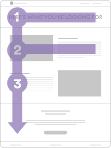
Consider where you want the audience to look. Do this by making strategic use of white/negative space or working the important copy into what designers call an F-pattern. This is the direction that people most commonly scan a page online and is a powerful tactic to remember.

Signpost your signup
When it comes to your Call To Action: clarity is everything. Be clear about where to click and provide the audience with just one route of action (this is not the time to confuse things with a random link or stray social media icon). Also, use your CTA copy to explain what’s going to happen next – will your audience receive ‘more information’ or be expected to ‘sign up’, for example. Transparency builds trust.
Talking of which…
Would you like more information about crafting a perfect landing page? Email Sim at sim@sim7creative.co.uk and he’ll send you some more insight into what works, as well as suggested layouts and copy lines. No charge, no sign-up, no drama!


